                |
 |
 Sponsors and Curators Sponsors and Curators
The Museum of Yo-Yo History is a labor of love, and we would not be able to stay up-to-date with exhibits without the support of our sponsors and curators. Big thanks go to One Drop Design and Duncan for supplying us with their latest models, YoYoExpert for their help and support, and to Cody Orr, TotalArtist and YoYoBrothers™ for allowing us to use their collections!
If you're a manufacturer, or just a big collector and you want to help support the Museum drop me at line at chimera@yoyomuseum.com
|
 |
 |
 |
|
|
|
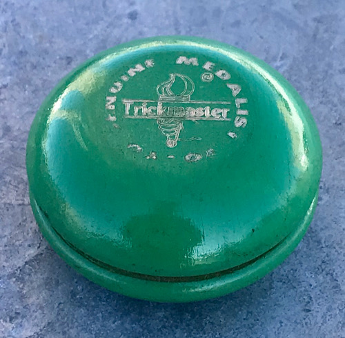
| Strombeck Medalist - Trickmaster |
| Exhibit #3400 |
 |
|
| Type | Production |
| Shape | Standard (-) |
| Axle | Fixed |
| Finish | Painted |
| Color | Green |
| Packaging | None |
| Construction | One piece wood |
| Response | None |
| Diameter | 2.25 |
| Gap | Fixed |
| Condition | Mint |
| Date | 1965 |
| Owner | David Hall |
| Compare |  |
|
|
When the original Duncan company went bankrupt in the early 1960's, Strombecker toys bought the equipment from Duncan, but NOT the Duncan name, and began producing their own line of yo-yos under the Medalist name. A BIG business mistake to not buy the Duncan name at the same time. Their line of yo-yos was not successful, and medalist disappeared after only a few short years.
That was the history as most of us knew it. I recently spoke with a member of the Stombeck family and they tell the story differently. It turns out that they were personal, long term friends with the the Duncan family. The Strombecks purchased the yo-yos and machines from Duncan as a favor to the Duncan's, to help them through the bankruptcy of Duncan Toys. They would try the yo-yo line, but really did not plan to replace Duncan in the industry. The Medalist line was just another product for Strombecker Toys.
Pictured here is a Green Trickmaster with Silver Impressed Logo, the one piece tournament from Medalist. The logo looks out of focus on many of these. It seems Stombecker had difficulty producing a high quality stamp when they started production. This one is a good example of logo issues. Contrast of silver with the green is poor, and the stamp is blurred in places, missing at the bottom. Still a nice example. | |
| |
|
Other Examples
|
|
|
|
|
| |
|
|
|
| |
|
|
|
|
|
|
 |
|


